Shelf Heatmap
Prerequisites
- A shelf zone must be defined under Zone settings.
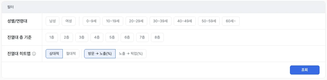
Report layout
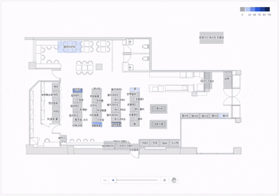
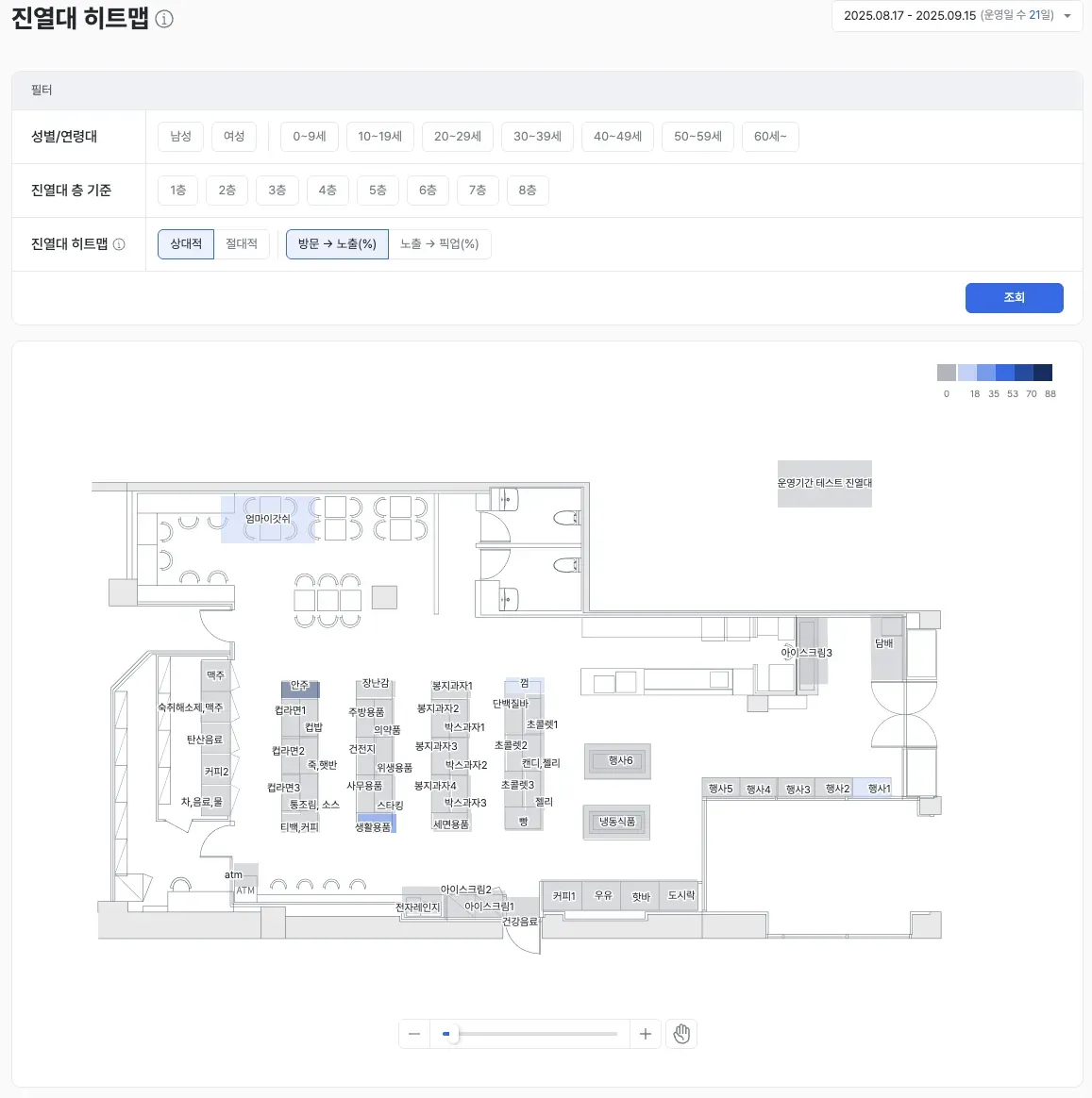
The Shelf Heatmap visually shows where shelves in your store are performing well. It color-codes performance for entire shelves and individual levels (rows), letting you see at a glance which shelves attracted gaze and pickup.
Core features
Customer exposure & pickup analysis
- See, per shelf, the share of customers who looked at it (visit → exposure) and the share who actually picked something up (exposure → pickup).
Examples
- Shelves with lots of looks but low pickup → Likely a product appeal or pricing issue.
- Shelves with frequent pickup but low purchase conversion → Inspect the payment path and shelf placement.
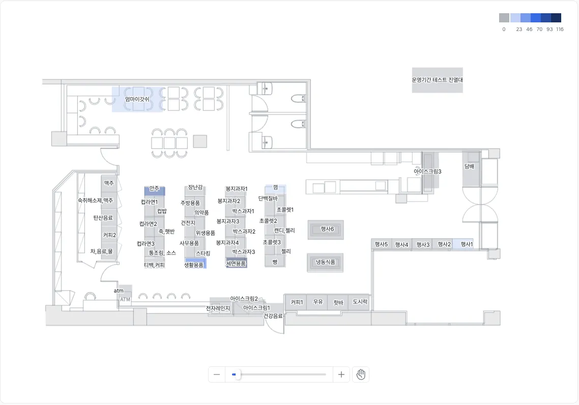
Color-based visualization
- Configure the color bands using absolute or relative thresholds.
- See performance differences intuitively through color intensity rather than raw numbers.
Examples
- Spot top-performing shelves at a glance using color contrast.
- Anchor on relative thresholds to compare against your store’s best shelf.
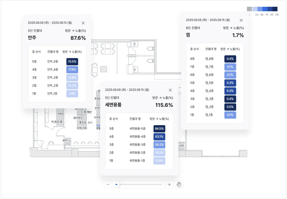
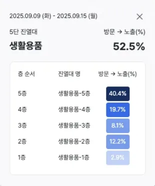
Shelf detail view
- Select a shelf to open a popup with detailed data.
- Inspect both the entire shelf and individual levels (rows).
Examples
- Identify shelves that customers walk past but rarely look at.
- Find levels (rows) with many viewers but few pickups.
Key metrics (KPIs)
| Metric | Description | Insight |
|---|---|---|
| Visit → exposure rate | Share of passing customers who actually looked | Diagnose shelf visibility and attention |
| Exposure → pickup rate | Share of viewers who actually picked up | How well interest converts to purchase behavior |
| Per-level performance | Performance at the row (level) of a shelf | Analyze height-based differences and improve placement |
Use cases
Product-placement optimization
- Many looks but few pickups → Identify pricing and display improvements.
- Frequent pickups but low revenue → Inspect the payment path and product mix.
Level-by-level insight
- See performance for top, middle, and bottom levels.
- Distinguish levels that get lots of looks but few pickups from those that are less visible but get many pickups, and improve product-placement strategy.
Marketing-impact validation
- Track gaze and pickup changes for specific shelves before and after a promotion.
- See impact in numbers and colors so you can measure the actual effect of ads and events.
Operational efficiency
- Identify the lowest-performing shelves in the store and prioritize improvements.
- Concentrate stock and staff on revenue-driving shelves to maximize operational efficiency.
Advanced tips
Summary
The Shelf Heatmap visualizes the performance of each shelf and its individual levels (rows) in color. Visit, exposure, and pickup data make it clear which shelves drove customer attention and action, and it’s a must-have for improving product placement, promotions, and operations with data.